Branding an Elite Hydration Therapy Experience
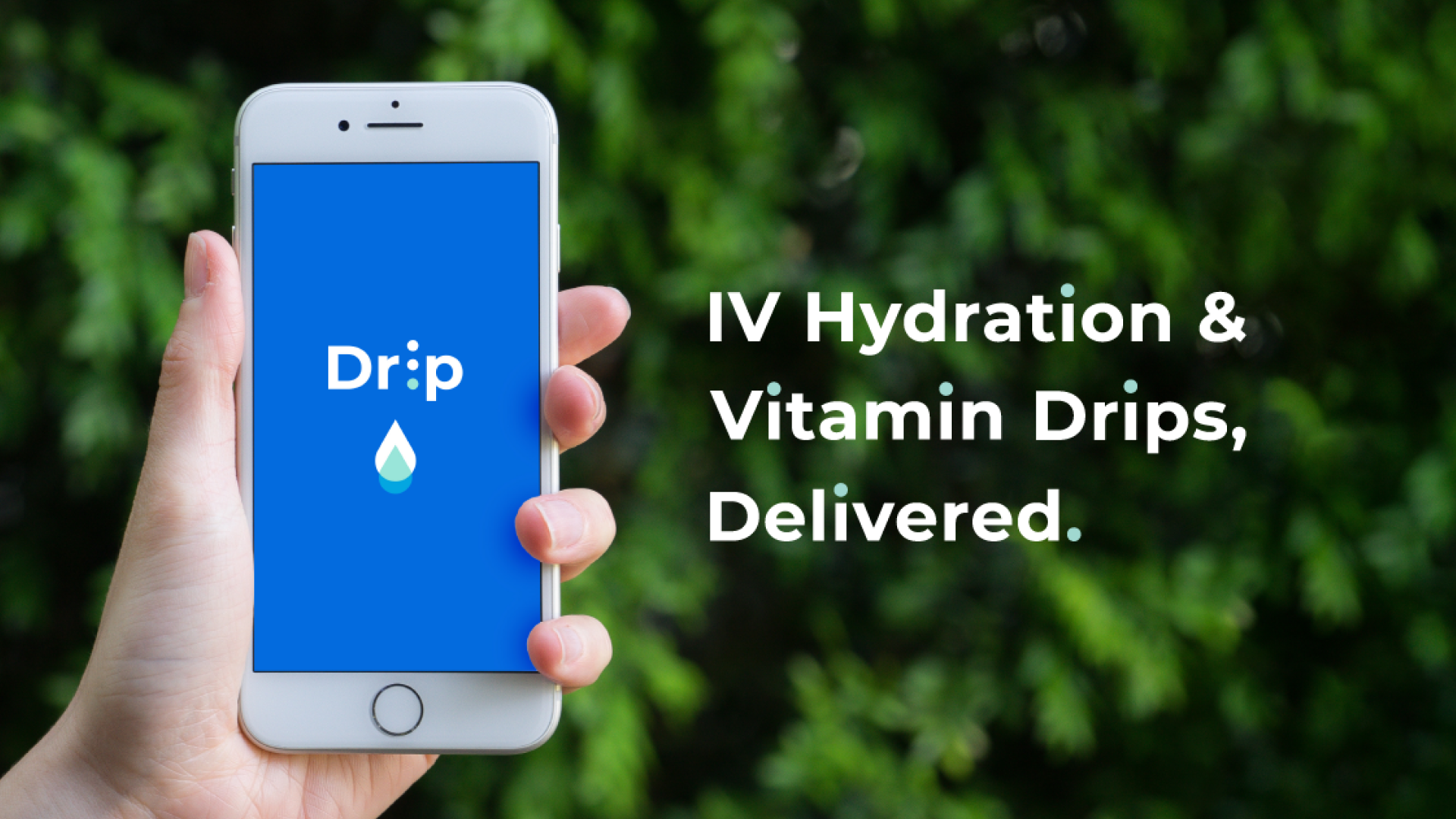
QUICK READ ➤ Drip Hydration is an IV therapy service catering to a high-end clientele, particularly within the Hollywood social scene. I developed the brand's logo, visual identity, and key graphic components to establish a bold, modern aesthetic while maintaining an air of trust and cleanliness.
Overview
The goal of Drip Hydration’s branding was to balance medical credibility with an upscale, lifestyle-driven appeal. IV therapy services often carry a clinical connotation, but Drip needed to position itself as both a health solution and a premium experience. This meant crafting a visual identity that felt both cutting-edge and inviting, avoiding sterile medical tropes while ensuring it stood out in a competitive market.
One of the key challenges in the design process was differentiating Drip from other IV therapy brands that had already entered the space. Competitors often leaned into either hyper-clinical aesthetics or overly playful designs. Our approach was to create something both bold and iconographic—something that would be instantly recognizable and effortlessly cool, yet still trustworthy.
The final design system utilized strong, clean typography paired with a sleek, minimalistic logo mark. The visual identity leveraged high-contrast elements and strategic use of color to create a look that felt fresh, modern, and unmistakable. The result was a brand that stood out in a crowded market while resonating with its target audience.

