Strategic Context
TestMax had always offered tutoring on a limited basis, typically to bar exam students who were really struggling, but it was a manual, ad-hoc service rather than a real product. As both bar and LSAT course usage grew exponentially, we recognized a much larger opportunity. Tutoring could serve as both an upsell to existing students who needed help over a hump and a new acquisition channel for prospects who wouldn't convert to self-paced study without a human in the loop.
To test the vertical, we built an MVP with paid marketing funnels, web and mobile purchase flows, automated post-purchase messaging, and tutoring balances tracked by the hour. Tutor assignment and scheduling were handled manually. The MVP quickly validated demand and grew into a real revenue channel, but it was high-friction enough that we had to hire two tutoring coordinators to manage the operational load. Their pain points and student feedback gave us a clear list of what the full product needed to solve: scheduling, rescheduling, cancellations, no-shows on both sides, reminders, student-tutor messaging, and tutoring balance calculation.
The Design Challenge
Translating the manual MVP into a scalable product meant designing for three distinct user types, students, tutors, and administrators, each with overlapping but different needs. The challenge wasn't just the scope of the pain points to solve. It was building a system that felt like one cohesive product rather than three disconnected tools stitched together, while reusing components and flows wherever possible to avoid unnecessary engineering lift. We were also designing for an additional layer of complexity: the underlying system was being built with the possibility that the same backend could power a white-label tutoring service outside the TestMax brand. That meant the architecture had to be general enough to re-skin while feeling native to TestMax in this first instance. And we were launching on web and mobile simultaneously.
Approach: Designing for a Large Surface Area
Three personas, multiple flows, many states, and two platforms added up to a lot of surface area. I started with loose wireframing to identify where the personas overlapped and where they diverged, before going deep on any one of them.
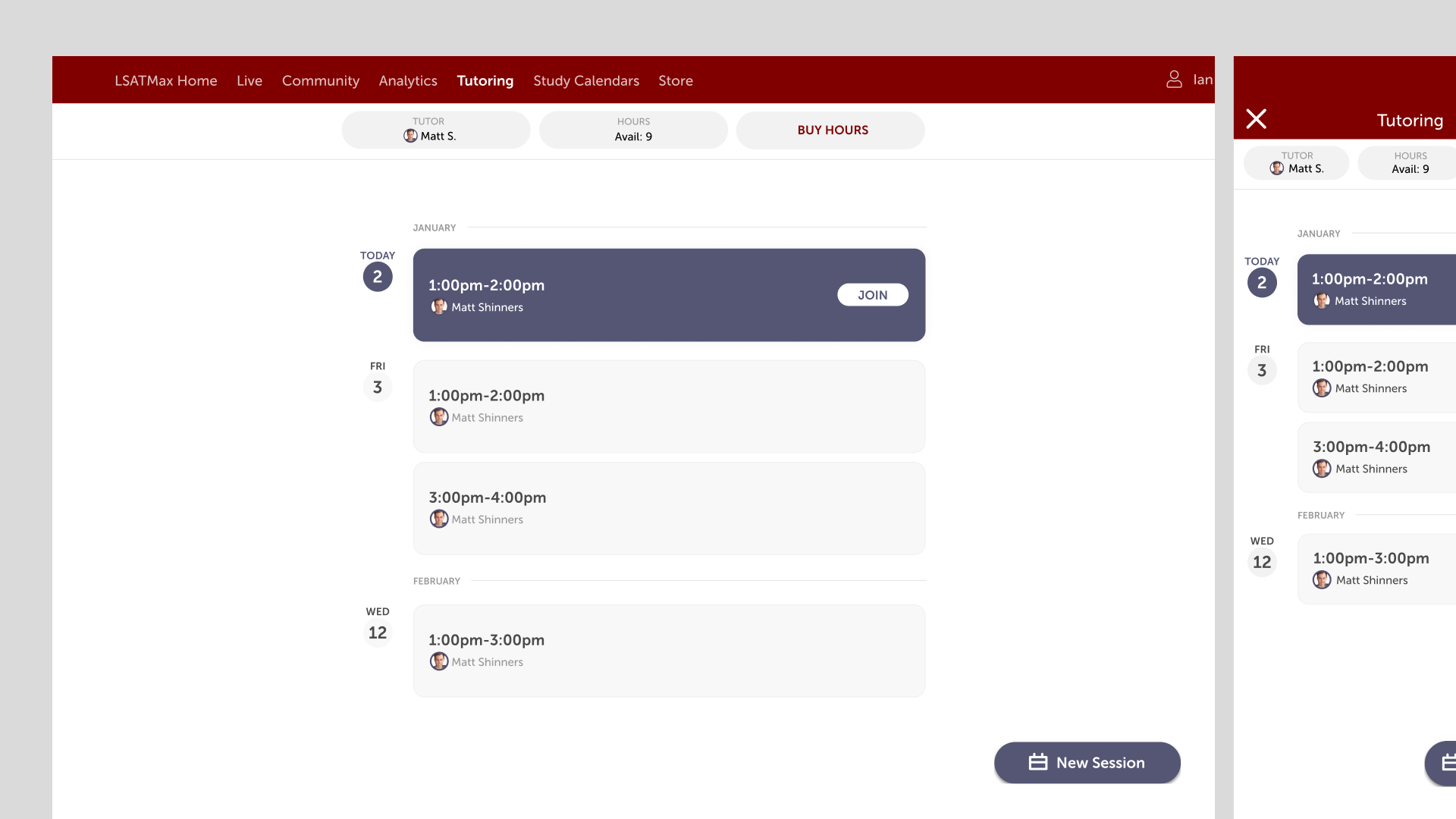
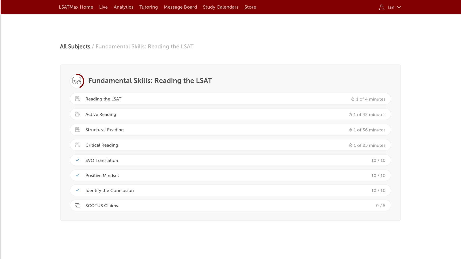
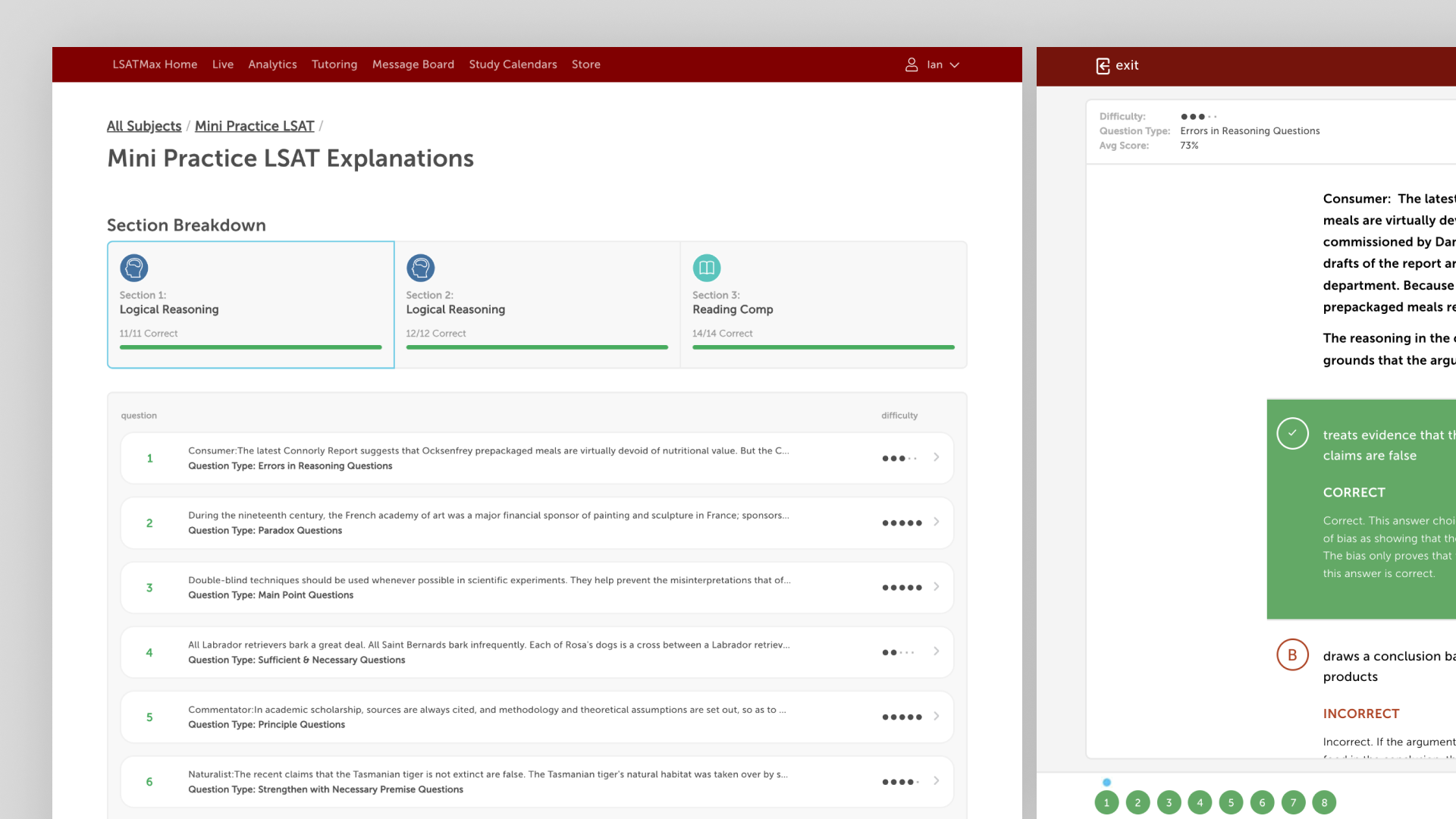
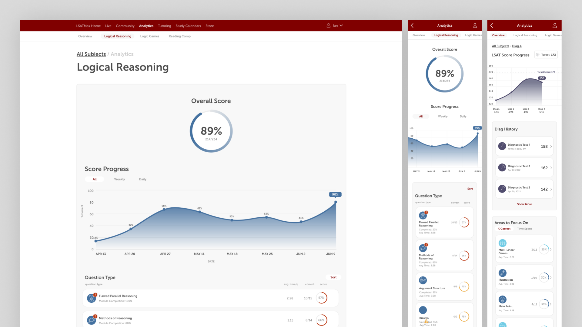
The schedule view had strong overlap. Students saw a timeline of upcoming sessions with one tutor, and tutors saw the same timeline with multiple students. Hours management and session history used identical UI with different context. Students saw scheduled and used hours; tutors saw scheduled hours with students and remaining availability. Booked-session management also used shared UI across all three personas with diverging affordances. Tutors could message students with prep materials and access phone numbers if there were issues with the meeting link. Students and tutors could cancel or reschedule within constraints. Coordinators could do the same without constraints.
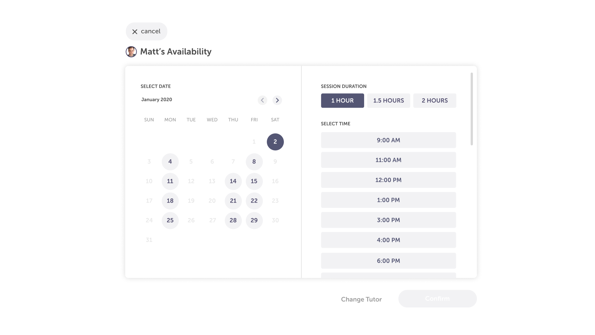
Where the personas diverged, I designed for the diverging need rather than trying to force a single pattern. Scheduling lived in the same wrapper and flow for students and tutors, but the UI did different work. Students used a calendar day and time picker to book one session at a time. Tutors used a different interface to set weekly availability and one-off date overrides. Coordinators needed a zoomed-out view of every tutor's schedule, which meant a weekly view wouldn't work because of session volume. I solved that with a side-by-side daily dashboard with horizontal scroll and tutor filtering. Coordinators also got their own dedicated flows for adding and removing tutors and reviewing student-rated session quality.
During wireframing, I pulled patterns from products with relevant scheduling and two-sided dynamics, including Zoom, Google Calendar, Calendly, Uber, Lyft, and Soothe, to understand how others solved comparable problems. Once I had alignment on the core architecture, I tightened up persona by persona, starting with students. I built prototypes for both web and mobile, presented to the team, iterated on feedback, and worked within the dev team's phased agile framework so design and engineering could move in parallel. Naming conventions and flow organization mattered at this scale. Without it, neither I nor engineering could have kept the system legible. After student flows reached sign-off, I added comments and callouts for handoff and walked engineering through the spec, then moved to tutor and coordinator flows on the same cadence.
Approach: A Unique Tutor Assignment Model
One signal from the MVP was that students wanted to evaluate the backstory and ratings of every available tutor before booking. They wanted the best tutor possible, which is an understandable instinct. My research into other tutoring services confirmed the same pattern: most allow students to browse and select up front.
That model didn't fit our business. Our tutors were effectively our employees, not independent marketplace participants, and we needed to give every tutor a fair chance to build experience and reviews. Letting students cherry-pick the top-rated tutor on every booking would have collapsed the system. So we designed a round-robin assignment for the first session, with tutor switching available after the student had completed at least one session.
The design problem was making this system legible. Students needed to understand it without feeling like the choice had been made for them. We leaned on two communication strategies. First, the assignment UI made the round-robin nature of the first session visible rather than hidden, and reinforced that all tutors were 99th-percentile scorers and thoroughly vetted to a consistent quality bar. Second, the UI changed state after the first completed session to surface tutor-switching options, so students saw the system open up to them rather than feeling locked in. The model worked. Friction dropped, and the tutor base stayed strong.
Impact
- Generated $2.5M in revenue in its first year, becoming one of TestMax's most profitable verticals
- Reduced operational load on coordinators by automating scheduling, balance tracking, messaging, and reminders that previously required manual handling
- High adoption rates validated the low-friction scheduling and round-robin model
- Improved student outcomes through personalized support, strengthening retention across the platform
Reflection
This was one of the cleanest projects I've shipped at TestMax. Strong process, good cross-functional alignment with engineering, and outcomes that matched what we believed was possible. The one thing left on the table was the broader two-way marketplace evolution. The system was architected to support a white-label tutoring service that could exist outside the TestMax brand, and we never got to build it. If we had, the design system underneath this product was already prepared to scale into it.