Role Consulting Product Designer
Scope Mobile, Web & Therapist App
Client Soothe (Enterprise)
Type Contract Engagement
Overview
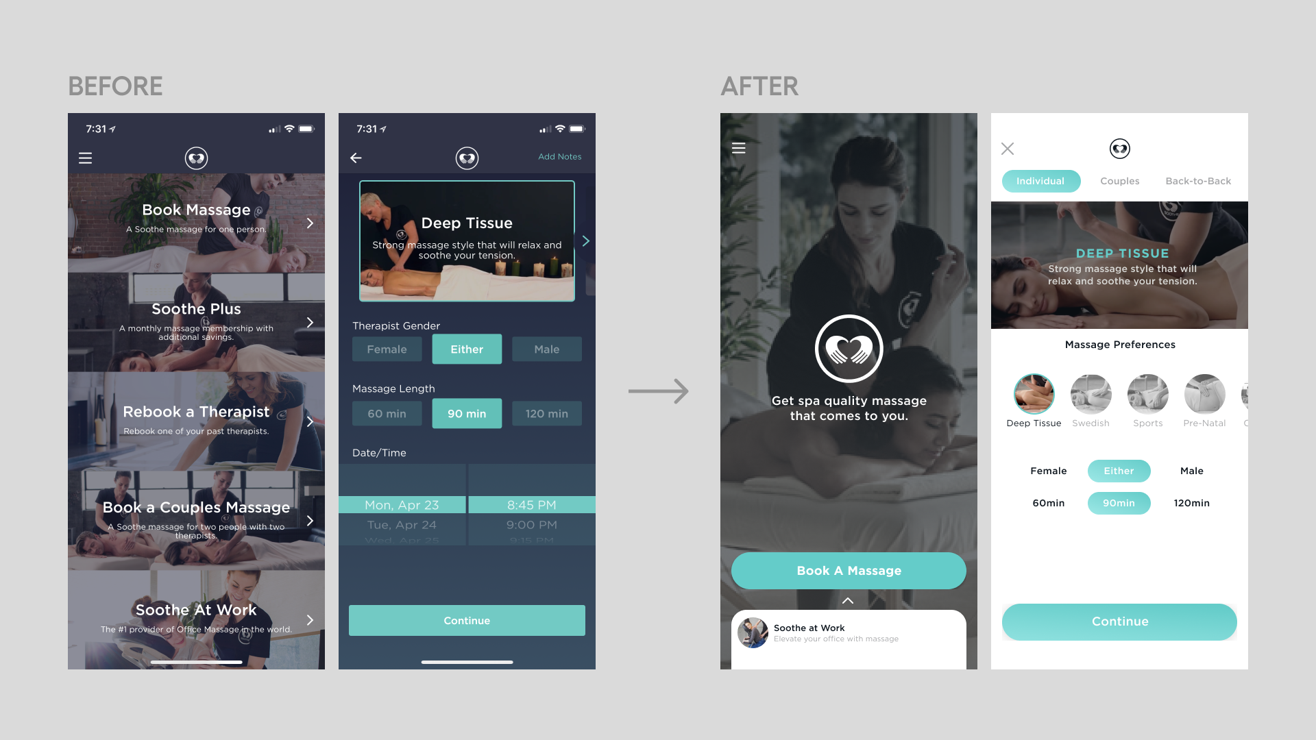
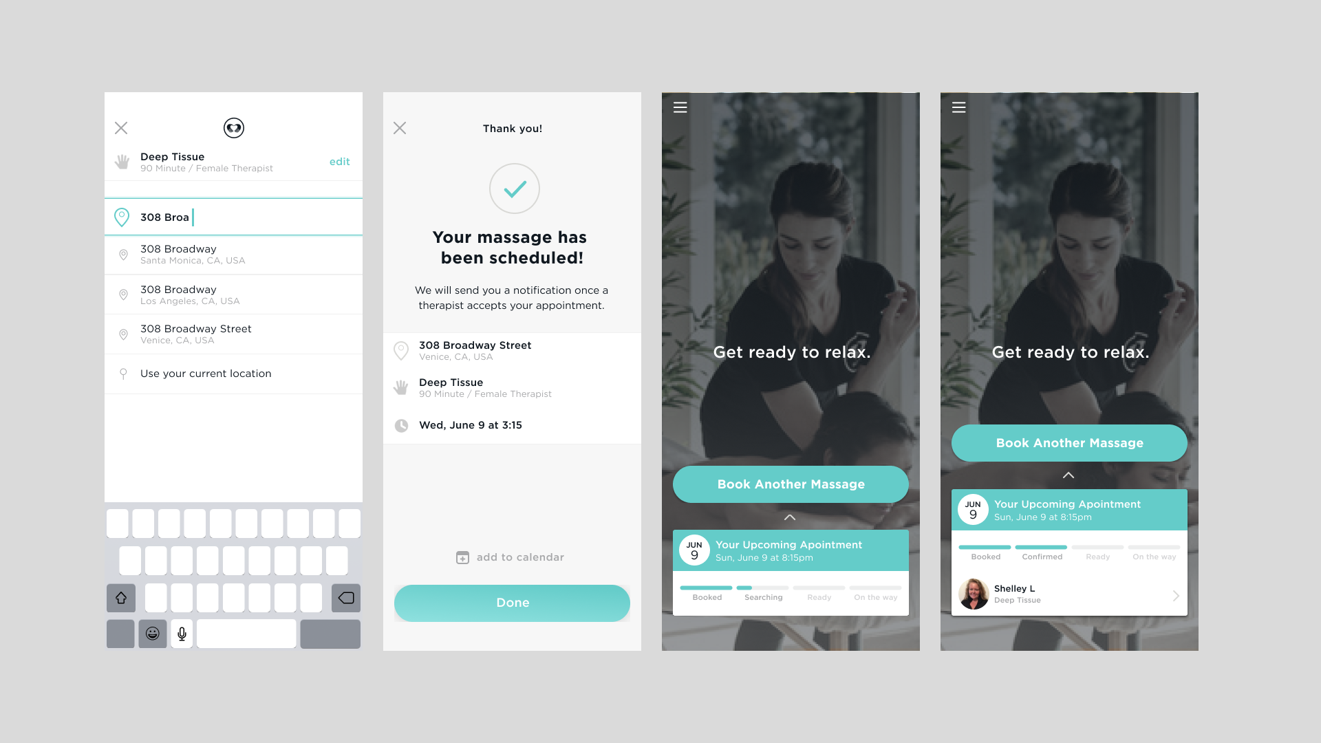
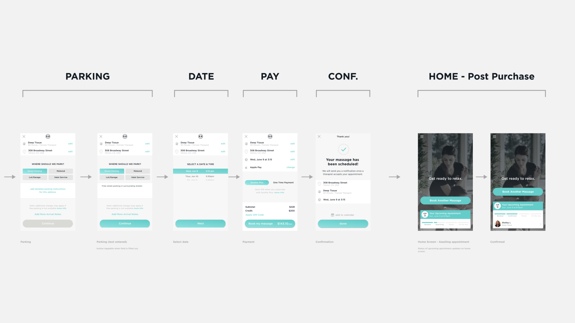
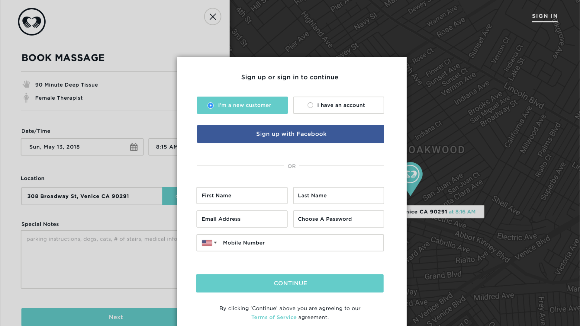
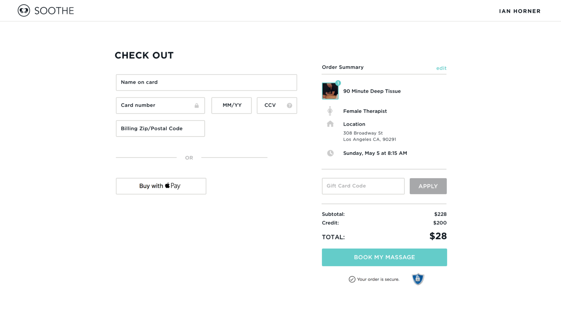
Soothe's previous digital experience was outdated, overly dark, and not reflective of its wellness-focused brand identity. The mobile app had a clunky booking flow that created unnecessary friction, there was no web-based platform for users who preferred booking on desktop, and therapists struggled to understand surge pricing in the offers they received. The engagement covered three workstreams end-to-end, from research and wireframes through high-fidelity design and handoff.