Driving Growth with Smart Funnel Design and CRO

UX Research Product Strategy CRO Marketing Design E-Commerce

QUICK READ ➤ TestMax is a legal test prep platform for the LSAT and bar exam. When the company expanded from mobile-only to a full web platform, I led the initiative to unify its fragmented web presence, optimize the sales funnel, and launch a structured Conversion Rate Optimization (CRO) program. I partnered with engineering and marketing while handling tracking integration, testing frameworks, and purchase flow enhancements directly. I also led a junior web designer through landing page work, providing creative direction and review.

KPI Highlights

2x

Increase in average order value within 5 years

20x

Growth in web revenue following checkout UX and funnel optimizations

41%

Increase in direct-to-web revenue share over 4 years, maximizing margin and control

+54%

Signup rate increase from multi-step onboarding flow test

+32%

Lift in conversions from testimonial-based landing page

+140%

Increase in blog-driven conversions for bar course via trial widget

Role  Product Lead
Scope  E-commerce platform, CRO program
Reporting to  Founders
Duration  ~5 years

Overview

TestMax's web presence was originally fragmented. Each product had its own separate domain, and the primary company website did not provide a unified brand experience. This structure weakened brand cohesion and significantly limited cross-selling opportunities. For instance, despite high satisfaction among LSAT students, very few returned to use our bar prep product due to lack of awareness.

As product lead, my mandate was to consolidate this presence into a single cohesive e-commerce platform and then build a system for continuously improving it. I led the technical consolidation onto a single domain (a delicate operation that required careful handling of search rankings to preserve organic traffic), and from there established a structured Conversion Rate Optimization program to refine onboarding, checkout, and acquisition funnels.

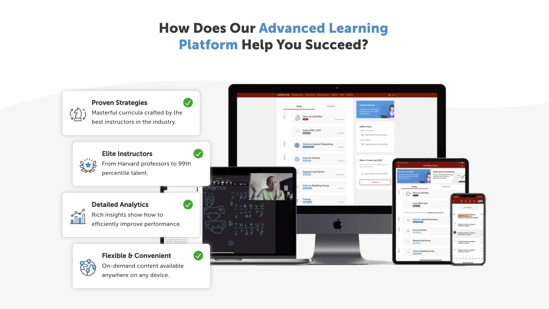
The work was hands-on. I handled much of the technical implementation directly, including tracking integration, testing frameworks, and purchase flow enhancements. For design execution, I directed a junior in-house web designer.
Unifying and Optimizing the E-Commerce Experience

Challenge

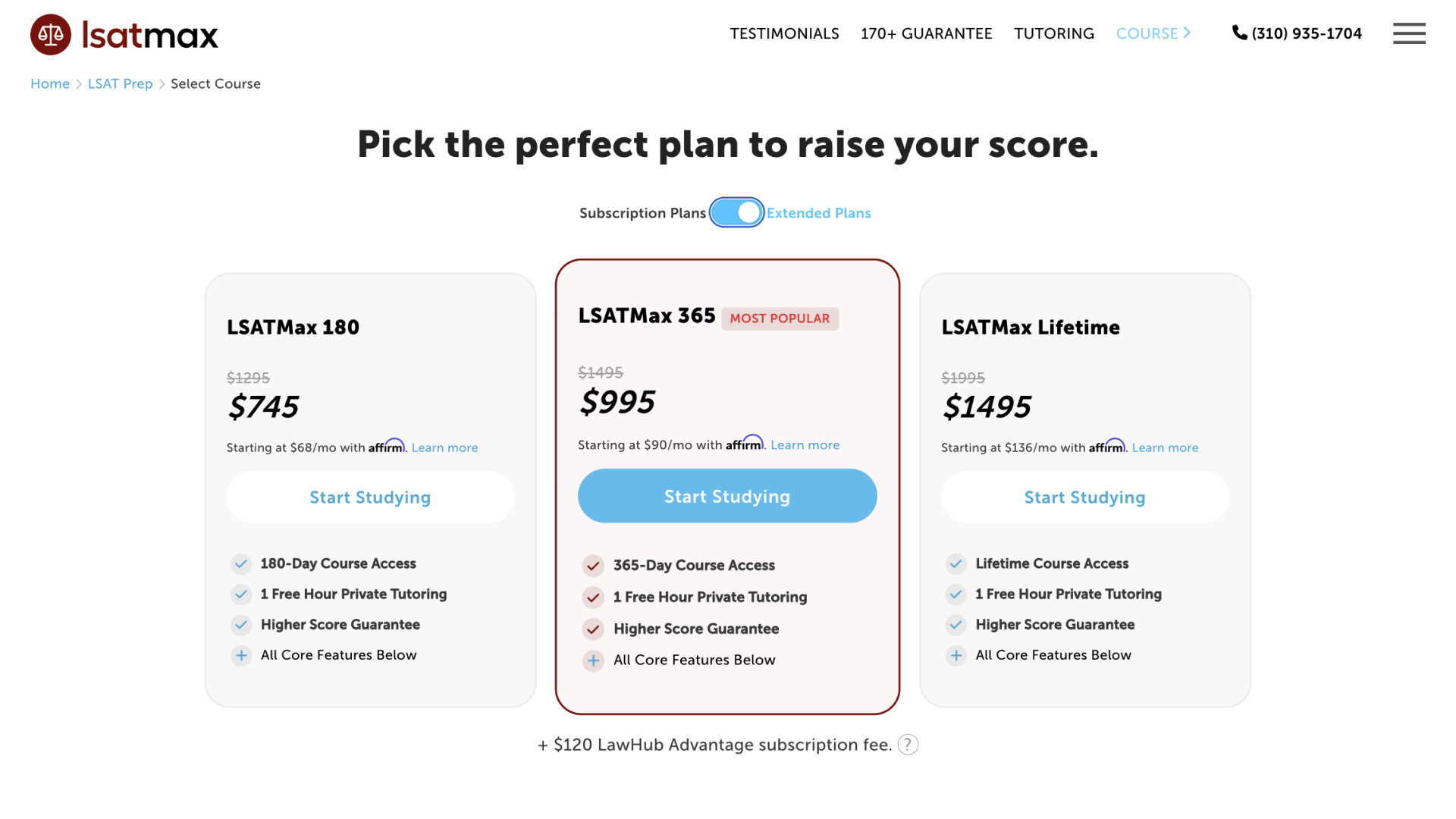
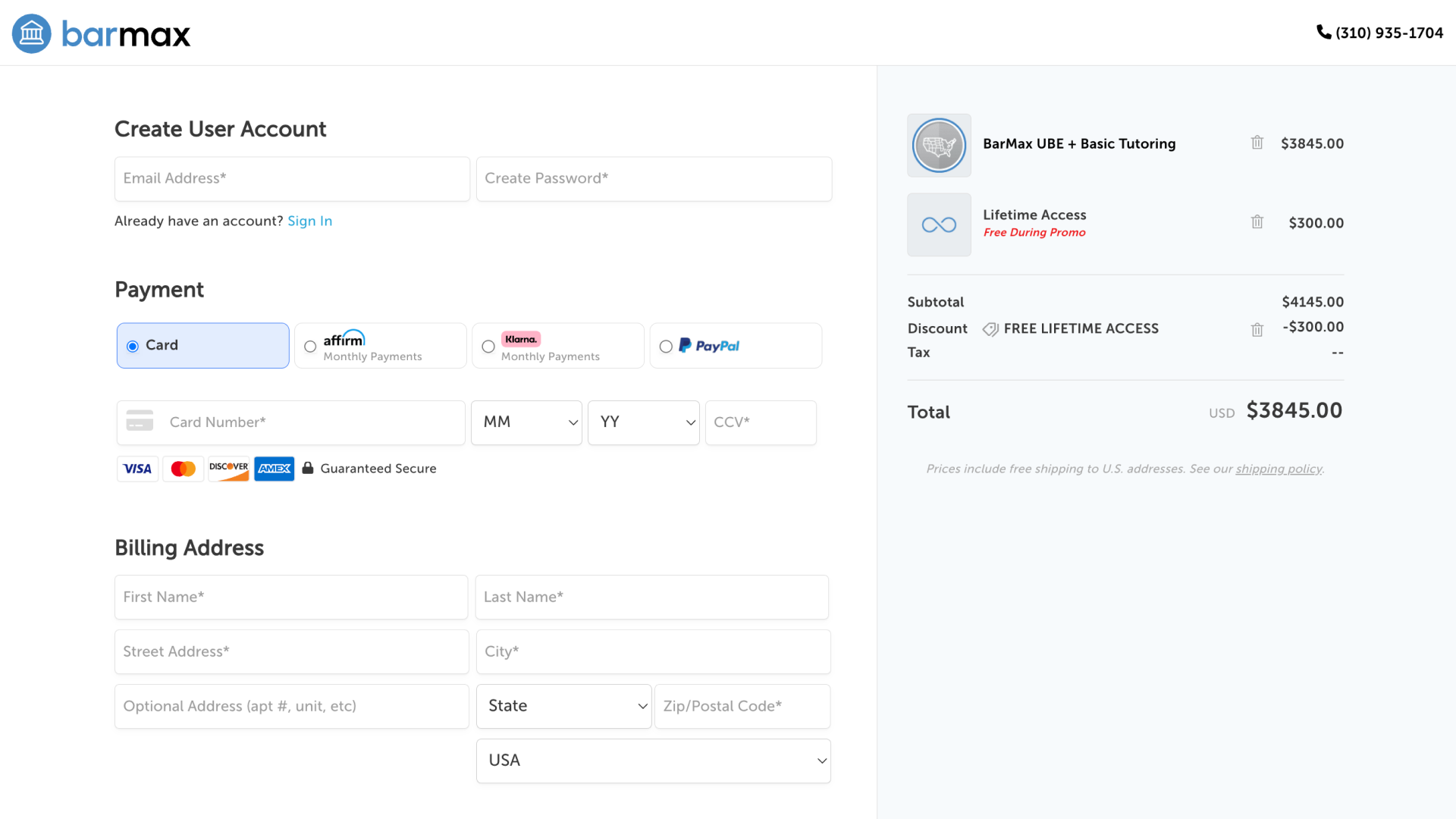
Originally, TestMax's e-commerce experience was fragmented across distinct domains, complicating checkout processes and making unified data analysis difficult. Students were also isolated from the broader brand, limiting our ability to effectively cross-sell.

Approach

Working alongside the development team, I designed a flexible, streamlined checkout experience built around a fully custom backend Stripe integration. We later expanded payment methods to include Affirm, Klarna, PayPal, and Apple Pay, directly increasing conversions and revenue.

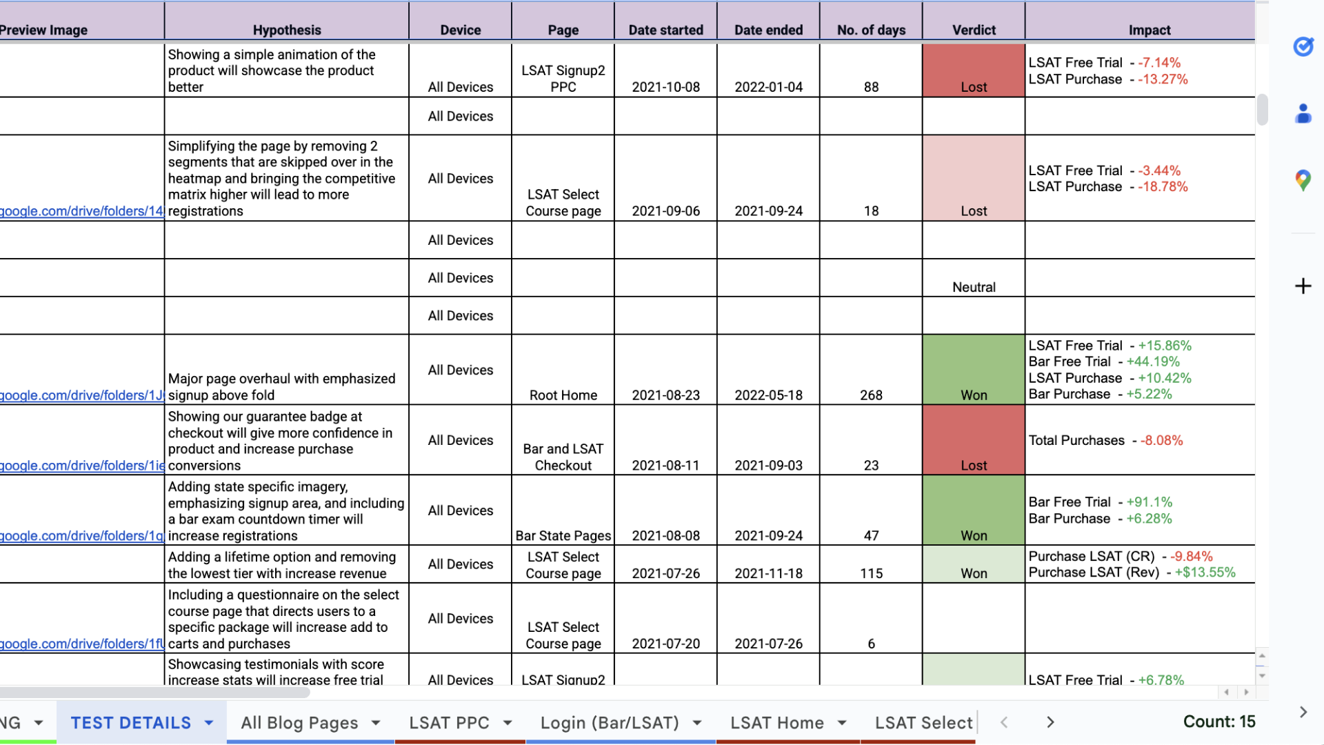
With the unified checkout in place, we ran a continuous testing program: each iteration was a hypothesis about a specific friction point in the flow.

Impact

  • Web revenue grew 20× over 5 years, ultimately accounting for 99% of all company revenue
  • The unified experience drove 25% web sales growth immediately following launch
  • Consolidating under a single domain enabled cross-selling between products for the first time, a structural revenue unlock

Landing Page Design & Optimization (CRO)

Challenge

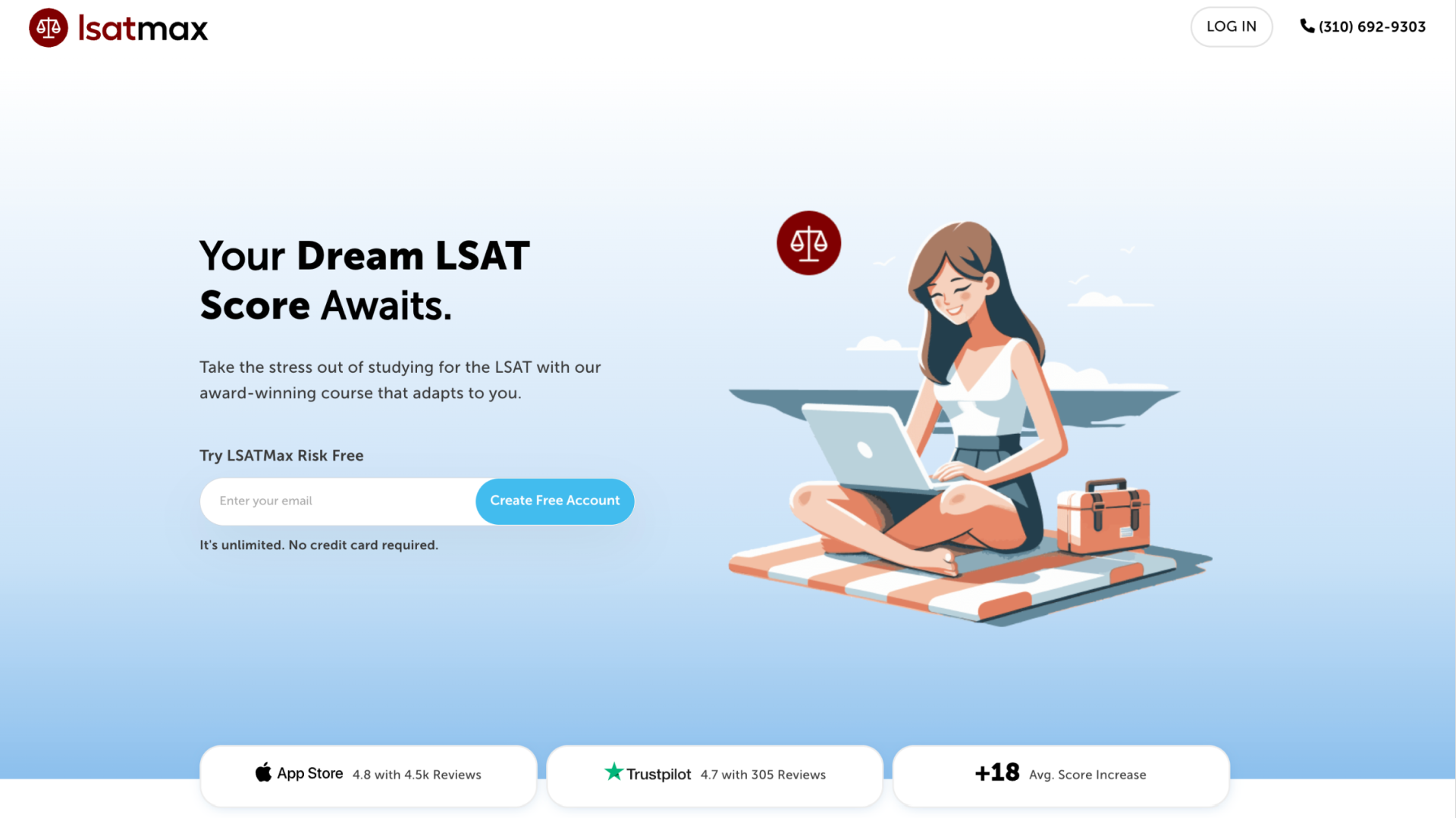
The existing freemium model struggled with low signup rates, limiting the number of qualified leads for our premium offerings. We needed to find solutions that would effectively capture more leads while simultaneously optimizing our user flows to drive paid conversions.

Approach

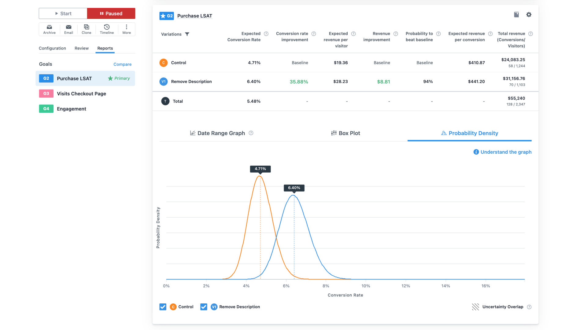
I built an A/B testing program around a hypothesis backlog drawn from analytics, support tickets, user research, and competitive analysis. Tests were prioritized by potential impact and learning value. Each one was structured to validate or invalidate a specific product or marketing hypothesis, not just optimize a metric.

Impact

We consistently improved sign-up and purchase conversion rates over time, demonstrating how both small and significant UX changes could drive meaningful revenue growth. Below are a few examples of high-impact optimizations:

  • 2-Step Registration Flow: Splitting signup into two steps (email first, then phone/password) increased conversion rates by 54%.
  • Phone Number Collection: Testing phone number capture during onboarding validated outbound calling and SMS marketing as highly effective channels for driving conversions and user engagement.
  • Testimonial Landing Page: Featuring student testimonials with score improvements as a visual element boosted sign-ups by 32%.
  • Blog Trial Widget: Adding an in-content free trial signup widget increased conversions from blog traffic by 56% for the LSAT course and 140% for the Bar course.

Conclusion

This project is where design and business strategy were most explicitly the same thing. Every test, every funnel change, every checkout iteration was a hypothesis with a measurable outcome. Over five years of compounding that process, web revenue went from a small fraction of the business to essentially all of it.