Elevating Doughnuts with Luxury Patisserie Style
QUICK READ ➤ Douxnuts is a conceptual brand for a boutique donut shop that merges indulgence with elegance. Inspired by iconic patisseries like Ladurée and Bottega Louie, the branding elevates the humble donut into a refined experience through a custom-scripted logotype and soft, sophisticated packaging.
Overview
Douxnuts was designed to answer the question: what if a donut shop looked and felt like a Parisian luxury house? The name itself plays on the French word “doux” (meaning “soft” or “sweet”), setting the tone for a brand rooted in delicacy, charm, and premium indulgence.
The centerpiece of the identity is a custom, hand-scripted logomark that blends classic serif forms with ornate flourishes. The design balances nostalgia and elegance, inviting customers into a sensory experience that feels as curated as a fine pastry counter.
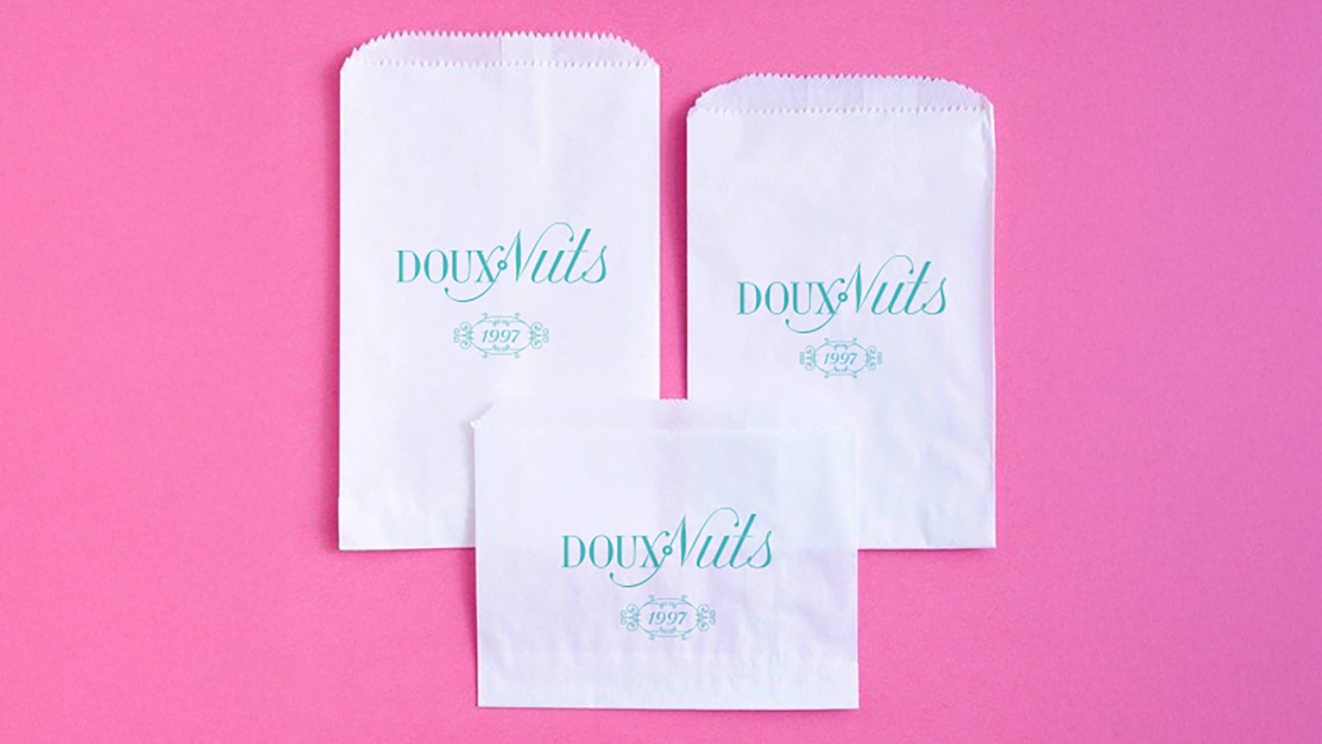
The visual language extends into packaging design featuring pastel tones, intricate ornamentation, and type treatments reminiscent of haute patisserie branding. From the logo to the decorative packaging, every detail was crafted to evoke the same joy and indulgence as the product itself.
Though a conceptual brand, Douxnuts showcases how thoughtful branding can transform a common product into an elevated experience—turning sweet into chic.
