Overview
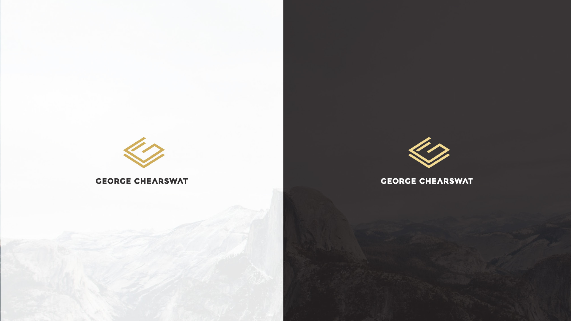
George needed a personal brand mark that could represent him in the competitive world of tech and product leadership — professional and bold, but with enough conceptual depth to reflect how he actually thinks. The brief called for something built around his initials that felt like a systems thinker made it, not just a designer.
The solution was a custom monogram using an isometric grid structure, weaving the letters G and C into a precise, angular symbol. The geometry echoes the modularity and clarity of great software architecture — reinforcing George's strengths without spelling them out. A gold-on-dark palette introduces a premium tone: confident and polished without being flashy. The mark is minimal enough to work across digital and print, and layered enough to reward a closer look.