Role Brand Designer
Type Conceptual Brand
Deliverables Logo, Logotype, Packaging Design
Overview
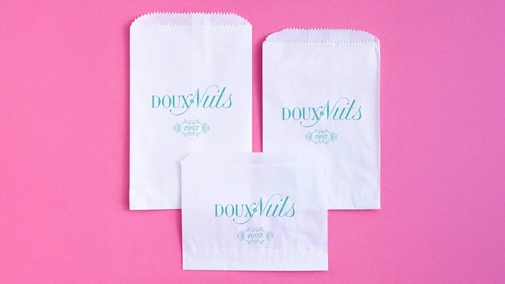
Douxnuts was designed to answer a simple question: what if a donut shop looked and felt like a Parisian luxury house? The name plays on the French word "doux" (meaning soft or sweet), setting the tone for a brand rooted in delicacy, charm, and premium indulgence.
The centerpiece is a custom hand-scripted logomark that blends classic serif forms with ornate flourishes, balancing nostalgia and elegance in a single mark. The visual language extends into packaging featuring pastel tones, intricate ornamentation, and type treatments drawn from haute patisserie references like Ladurée and Bottega Louie. Every detail was designed to evoke the same sense of occasion as the product itself.