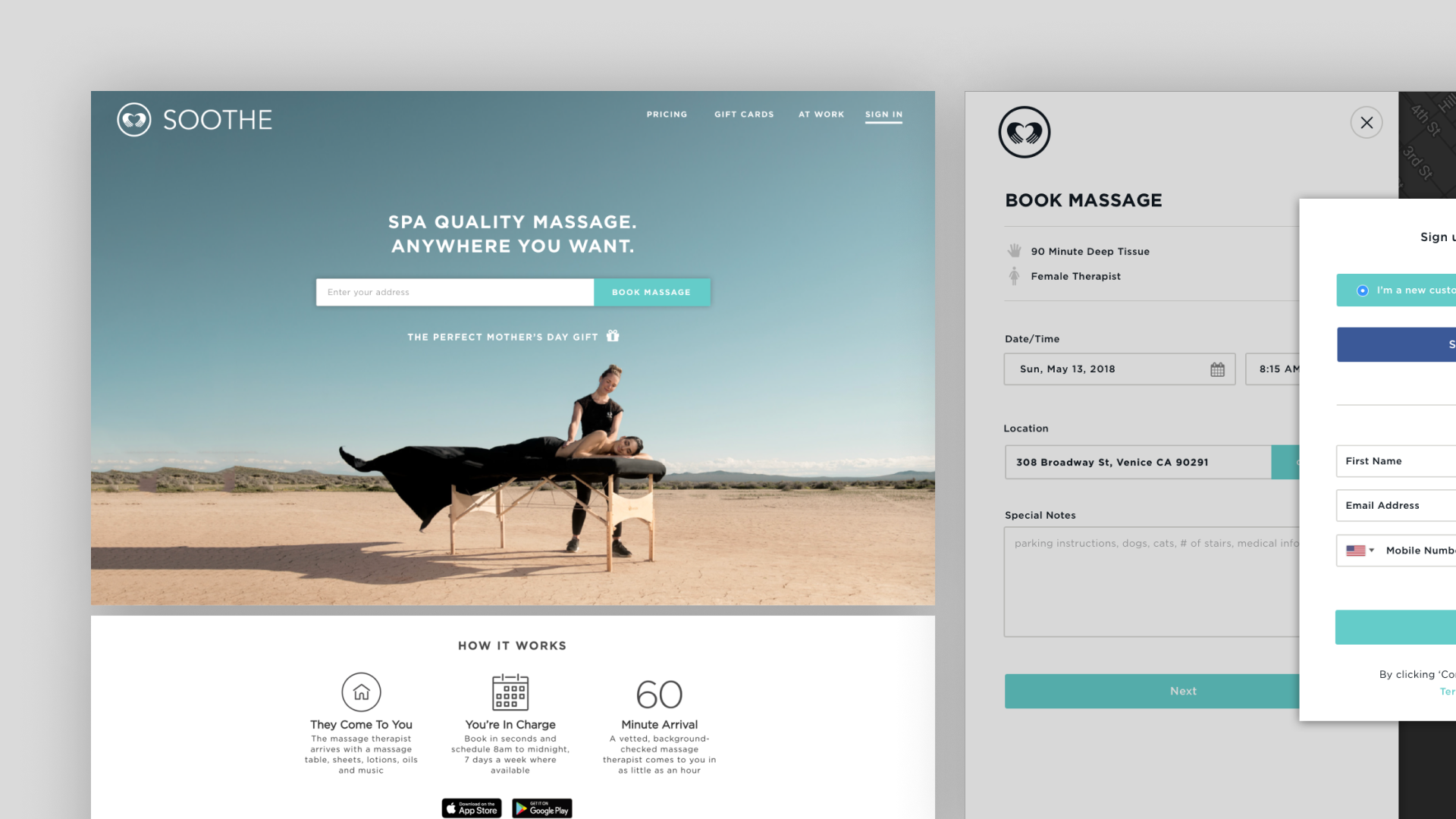
Web Home / Onboarding
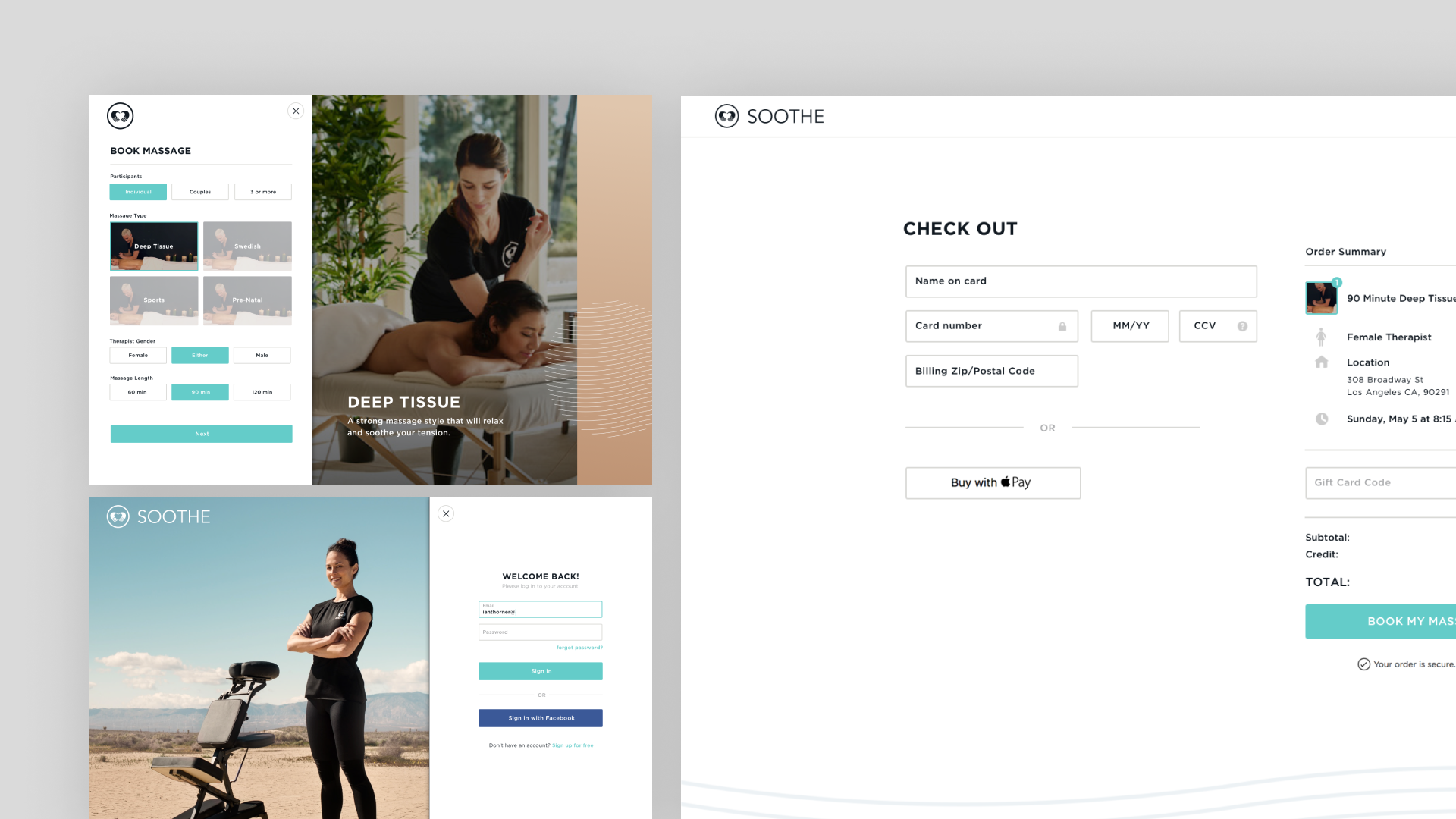
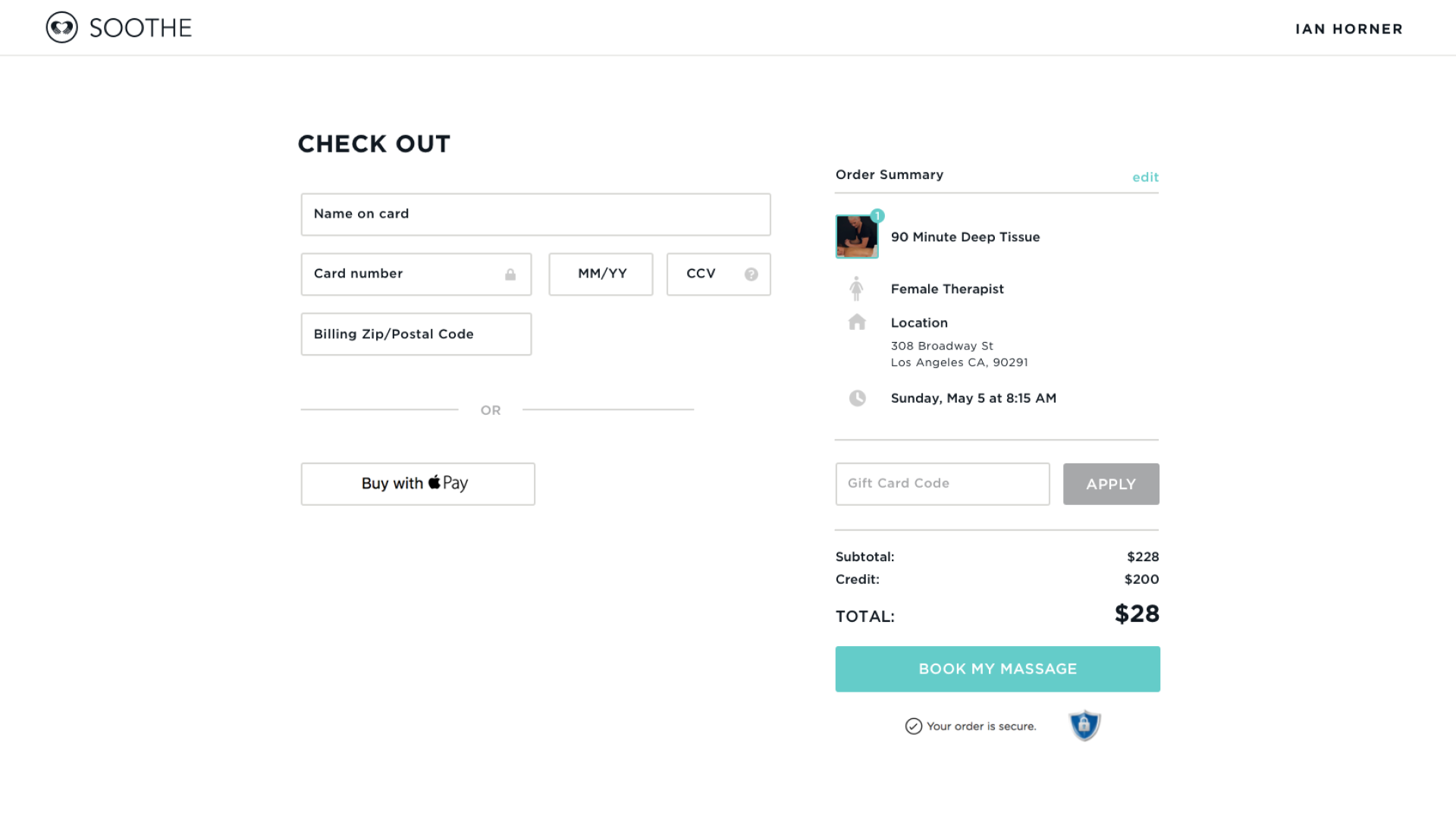
Booking / Checkout
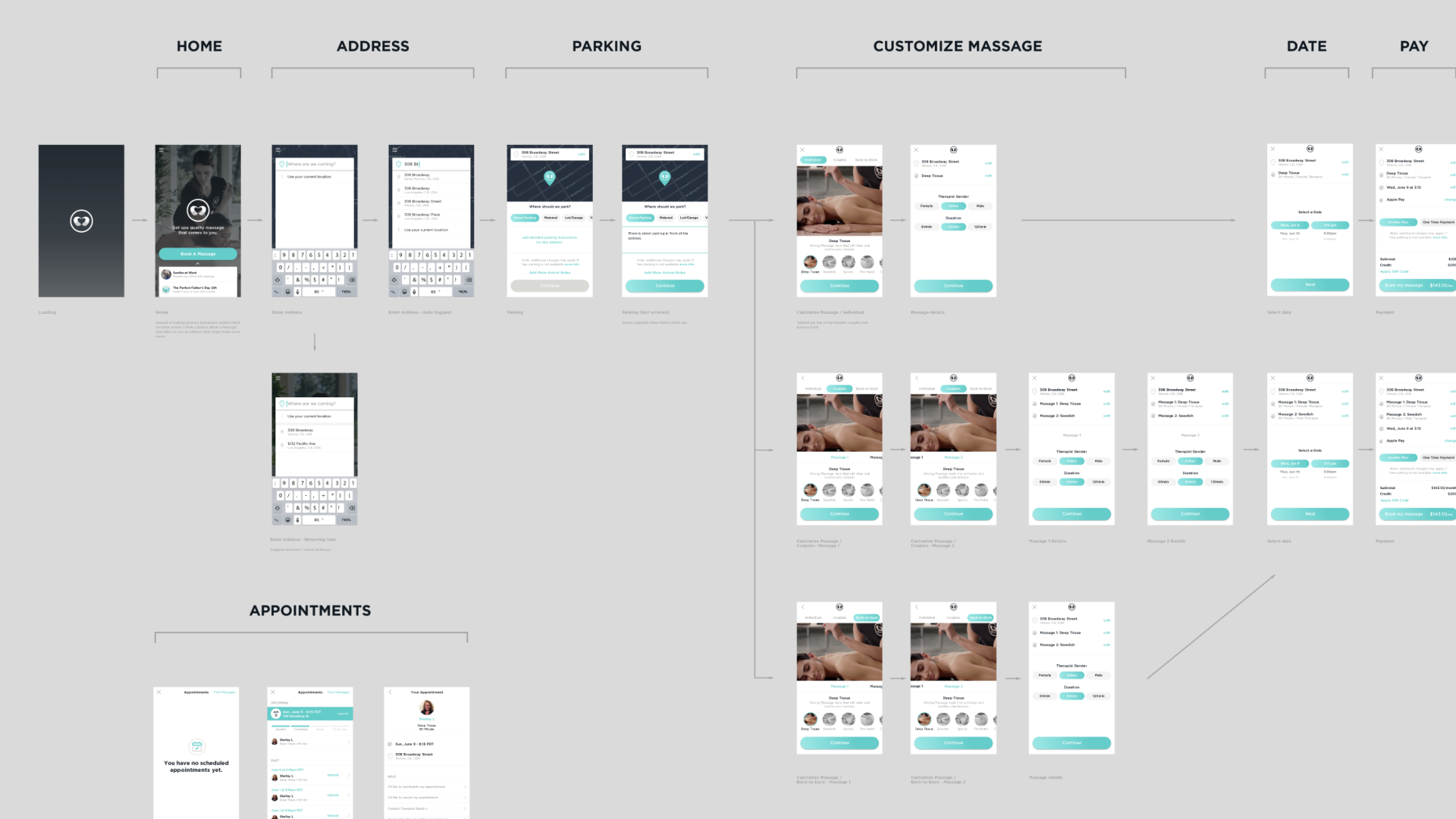
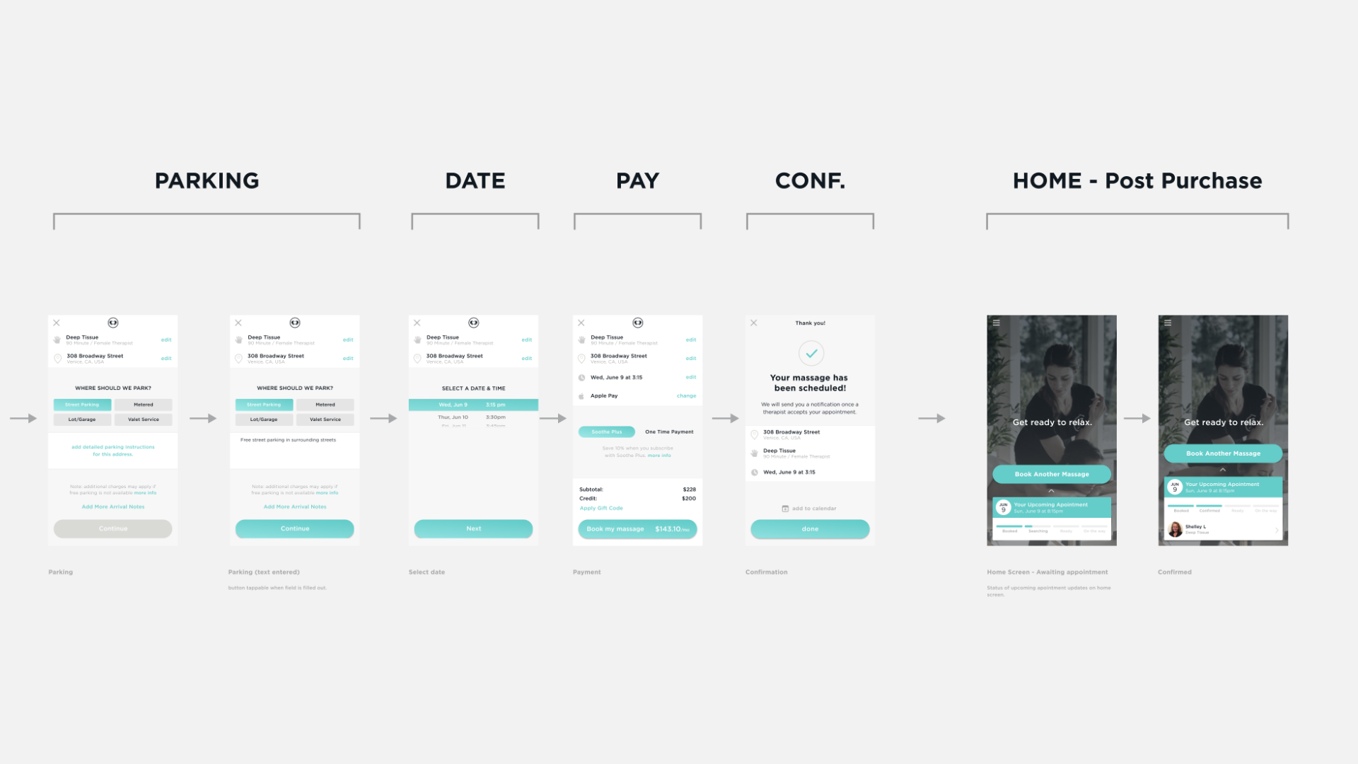
Booking Flow Specs
Optimizing Elegant UX for Established Wellness Brand
QUICK READ ➤ Soothe connects clients with licensed massage therapists for on-demand, in-home, and on-location services. The company’s digital experience needed a significant update to align with modern UX standards, improve usability, and drive revenue. In collaboration with the Soothe product team, I led the redesign of the mobile app, developed a new web booking platform, and refined the therapist application to improve clarity around surge pricing. My goal was to create a seamless, calming, and efficient experience across all platforms while maintaining brand consistency.
Overview
Soothe’s previous digital experience was outdated, overly dark, and not reflective of its wellness-focused brand identity. The mobile app had a clunky booking flow that created unnecessary friction, and there was no web-based platform for users who preferred booking on desktop. Additionally, therapists struggled to understand surge pricing in the offers they received, which impacted booking efficiency.
My approach focused on three key areas:
-
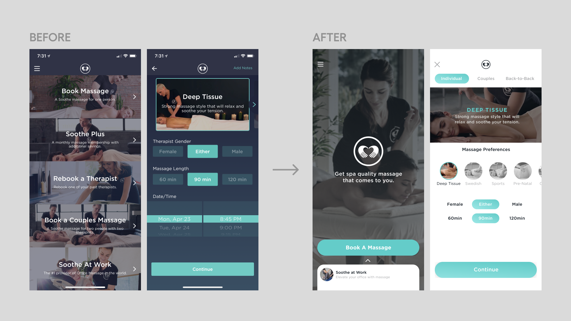
Mobile App Redesign – Modernizing the interface, improving accessibility, and refining the booking experience while introducing the new Soothe Plus subscription service.
-
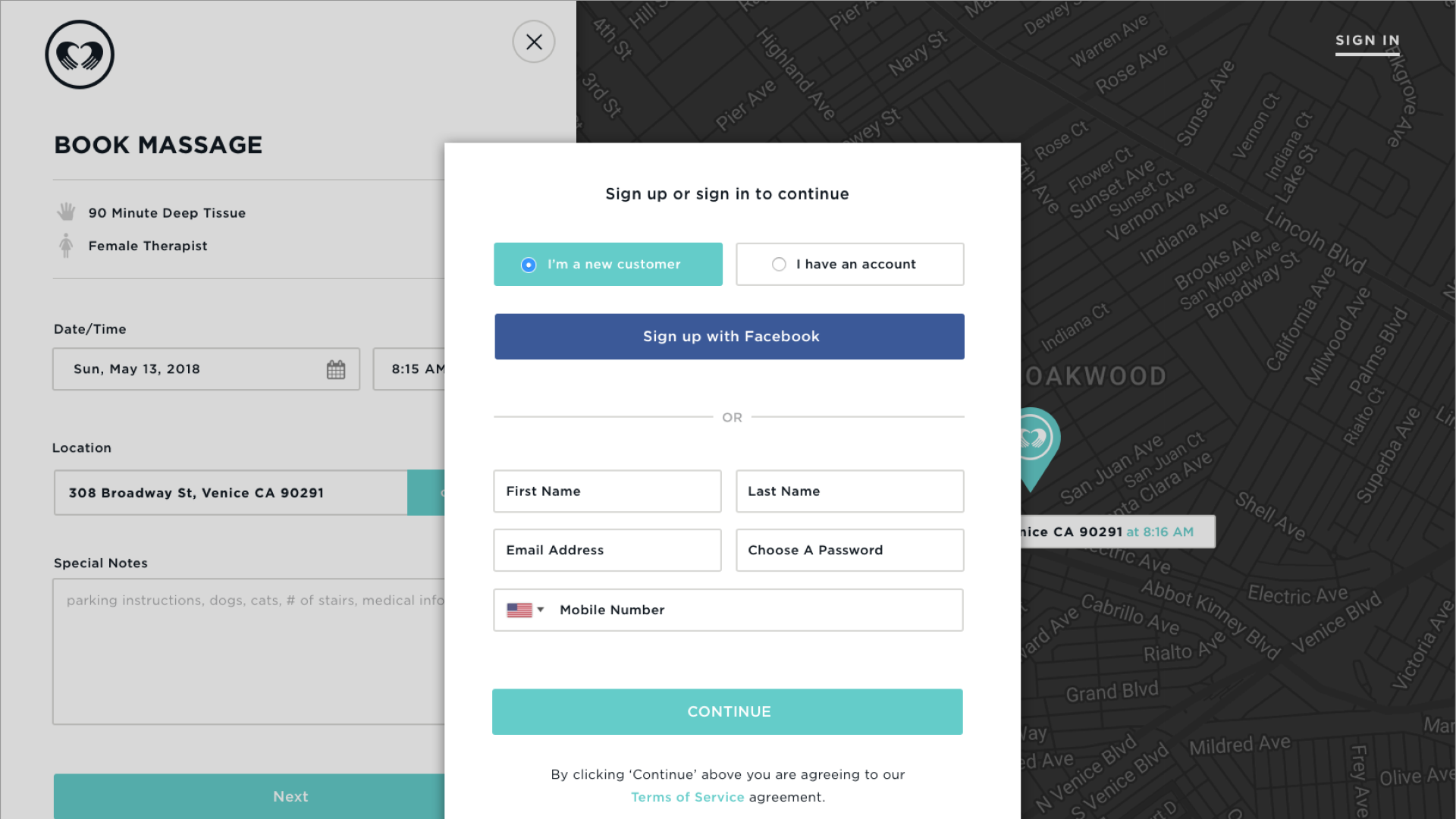
Web App Design – Expanding user access by creating a streamlined, visually cohesive web booking platform.
-
Therapist Application Enhancement – Redesigning offer views to clearly communicate surge pricing and help therapists make informed decisions.
Through these updates, the redesigned platform provided a more intuitive, visually engaging, and revenue-driven experience for both clients and therapists.
Mobile App Redesign
Challenges & UX Issues
The existing mobile experience was outdated, failing to align with modern UX best practices or the company’s branding. The app:
- Felt overly dark and interface-heavy, lacking the calming and therapeutic feel expected from a wellness-focused service.
- Had an inefficient booking process that created friction for users.
- Did not reflect the company’s updated branding direction.
- Lacked a clear framework for introducing the new Soothe Plus subscription service.
Key Improvements
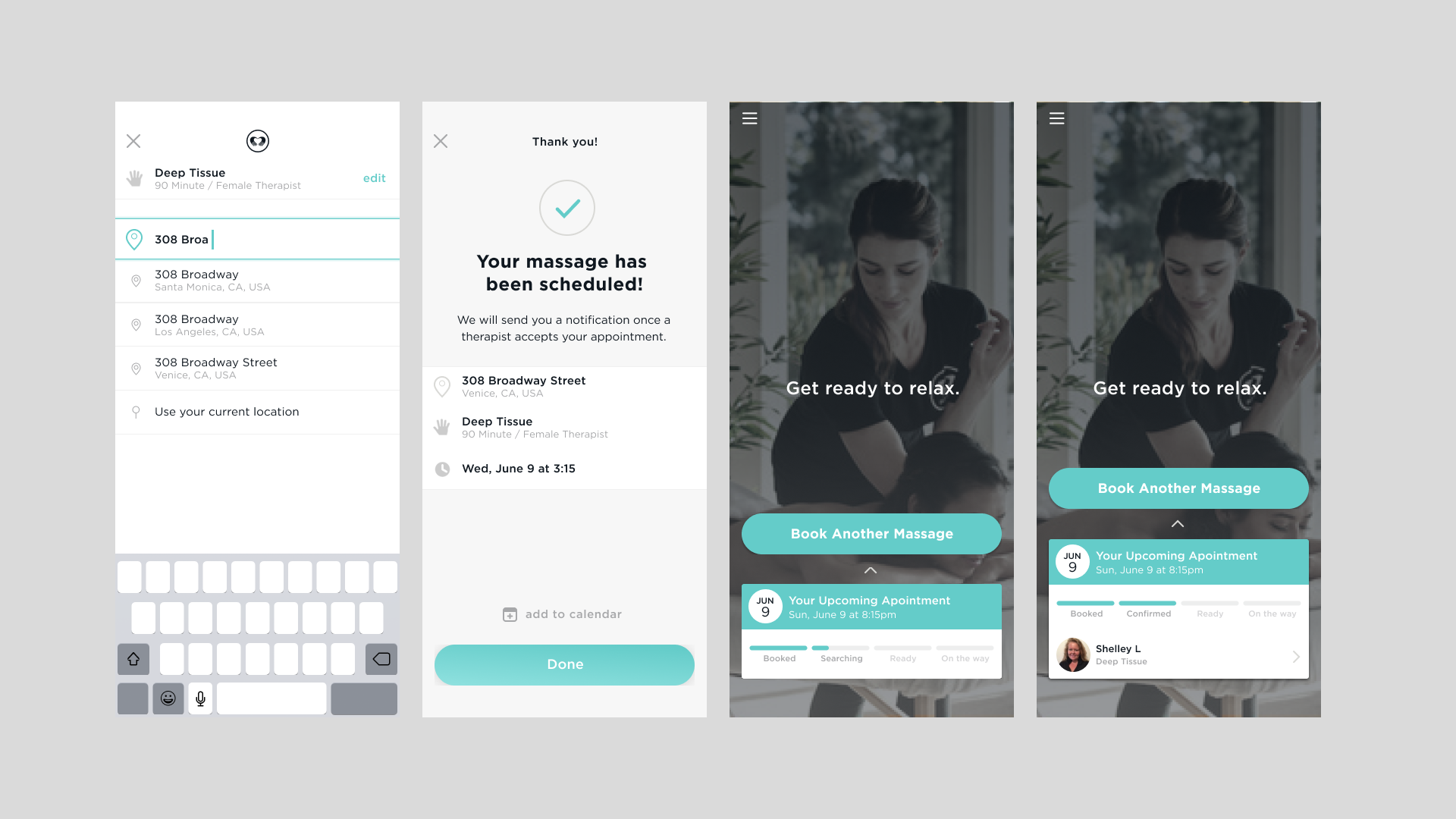
- Refined Booking Flow: Simplified steps, improved navigation, and clearer CTAs to reduce friction.
- Enhanced Visual Language: Introduced a lighter, more inviting color palette while maintaining core brand colors. The design leveraged high-quality imagery to create a calming aesthetic.
- Improved Accessibility: Adjusted contrast ratios, increased touch target sizes, and refined typography for better readability.
- Subscription Integration: Seamlessly incorporated Soothe Plus into the booking and checkout process, ensuring clear communication of its benefits.
Balancing Familiarity & Innovation
- Retained key photographic imagery from the original design to maintain brand recognition.
- Kept the naming of service modalities unchanged for continuity.
- Drew inspiration from industry leaders (Uber, Lyft) to implement intuitive interaction patterns while maintaining a distinct Soothe identity.
Web App Design
Project Goals
The web platform expansion was aimed at:
- Increasing accessibility for users who prefer booking on desktop.
- Reducing friction in the booking process.
- Aligning the web experience with the newly designed mobile app.
- Ultimately driving higher conversions and revenue.
Key Adaptations for Web
- Booking Optimization: Web allowed for fewer steps in the booking flow compared to mobile, streamlining the process.
- Incorporation of Video: The web experience leveraged more video content to enhance engagement and provide better service explanations.
- Cross-Platform Parity: Ensured consistency in branding and experience between mobile and web while respecting the unique interaction models of each platform.
Challenges in Designing for Both Platforms
- Adapting UI patterns and navigation structures while maintaining a unified experience.
- Optimizing for varying screen sizes and user expectations.
- Ensuring a seamless cross-device experience for users who start on one platform and complete their booking on another.
Therapist Application Enhancement
Challenges & Pain Points
Therapists were struggling to understand surge pricing in the offers they received, making it difficult for them to make informed decisions about which bookings to accept. The lack of clarity led to confusion and inefficiencies in therapist scheduling.
Solution & Redesign
- Clearer Offer Views: Redesigned the offer screen to clearly communicate surge pricing details.
- Better Decision-Making Support: Provided visual indicators and structured pricing breakdowns to help therapists quickly assess earnings potential.
- Implementation Success: The redesigned feature was ultimately deployed, improving the booking experience for therapists and increasing engagement with high-demand appointment requests.
Conclusion
This redesign was a comprehensive effort to modernize Soothe’s user experience across mobile and web platforms while ensuring therapists had the tools they needed for success. By balancing usability improvements with brand consistency, the new design elevated Soothe’s digital presence and enhanced both customer and therapist experiences.
